
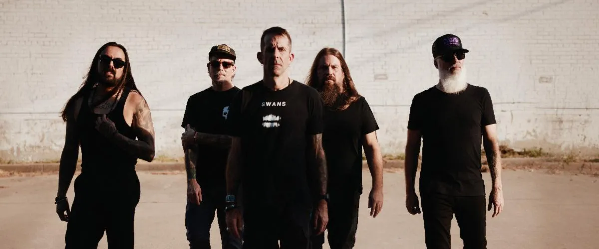

This week’s Lamb of God news cycle has revolved more around typography than riffs, as the band’s once‑declared‑retired papyrus‑styled logo made a surprise comeback on a May 5 admat announcing the band’s early 2027 European/UK tour with Five Finger Death Punch and Bleed From Within. The reappearance quickly lit up fan feeds with speculation: Was this just a branding oversight, or does it mean the old look is back in the fold?
The band’s prior “retirement” narrative was built on both Randy Blythe’s self‑mocking comments about the Papyrus font—famously likening it to a falafel‑restaurant menu—and the aesthetic pivot for the new album ‘Into Oblivion’. That framing had led many to expect the old logo would stay mothballed, which is why seeing it on the latest promo ad caught people off guard.

Now Lamb of God guitarist Mark Morton has chimed in directly on the situation, using a short, tongue‑in‑cheek Instastory post to cut through the noise:
“…y’all funny as hell man. the most recent @lambofgod logo is literally the SEVENTH logo we’ve used… and all have remained in rotation for different things at different times… but ohhh the despair. also….enjoy Dead Horse.”
By pointing out that the band has already cycled through seven logos—each of which still shows up in different contexts—Morton is effectively underlining what he’s said elsewhere in interviews: the Papyrus logo isn’t gone, it’s just been dethroned as the main face of the band for this era, not buried in a metal‑merch equivalent of a landfill.
If you’re rocking with The Mosh Network, hit the link and add us as a Preferred Source on Google. That’s the easiest way to keep our latest metal, hardcore, and alternative news, tours, and releases showing up directly in your feed.

1 Comment
Read more:
https://springgreen-caribou-353428.hostingersite.com/mark-morton-lamb-of-god-papyrus-logo-return/